Excess mortality blog post #4
We continue to adjust to changes brought on by COVID-19 and, as we move through the Government’s phased reopening of society, we have started to see some ‘normality’ return to life in Ireland. However, this has coincided with an increased number of confirmed cases in recent weeks which emphasises how finely balanced the situation is and how spikes in cases could increase the likelihood of a second wave.
In this post we refresh our previous analysis to include July data from RIP.ie. All data processing and analysis has been undertaken in line with the approach outlined in our earlier blogs.
While the July data shows an overall improvement in excess mortality, this is an ever-changing situation and the daily confirmed cases for the first week of August are more than double the average daily figures reported in July. Therefore, we need to continue to review our analysis and use this to help draw conclusions on the most up to date data.
Analysis of deaths in Ireland
The chart below shows the number of deaths reported through RIP.ie in each month of 2020 against the average number reported for the same month over 2015 – 2019. Confidence intervals of two standard deviations are included in the grey bars for perspective.
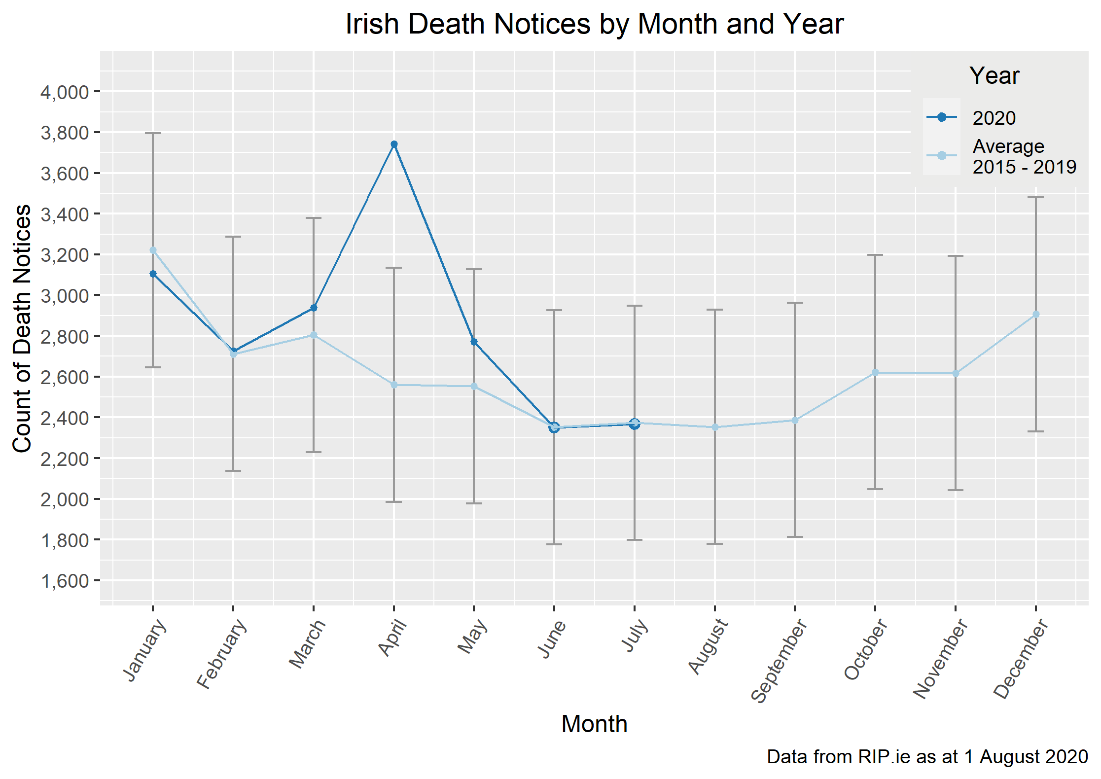
As noted in our previous blog posts, the data shows a sustained period of above average number of reported deaths for March to May – with deaths in the month of April being significantly higher than the 5 year average. The reported deaths in June were back in line with the 5 year average and we see the same happening in July. This is consistent with the low number of COVID-19 deaths reported by the HSE.
This experience shows that Ireland is now through the first wave of the virus but the threat of a second wave still exists – the daily number of confirmed cases has increased over July through to the start of August and some of the Government restrictions remain in place. The global situation is very volatile and other countries have shown signs of possible second waves.
Analysis by gender
The chart below shows the percent of death notices that were male in each month of 2020 against the averages from 2015 – 2019 and confidence intervals.
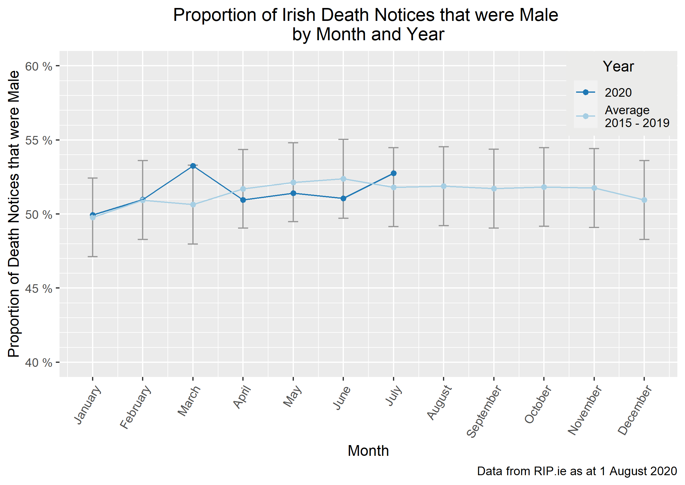
In our last blog post we explored the possibility of a female bias in the April – June data, and the fact that March had disproportionately more male deaths reported.
The July experience is showing a higher proportion of male deaths, at 1% higher than the normal July average (although still within the confidence interval) and between 1.5% - 2% higher than the April – June 2020 proportions. The higher than normal proportion of female deaths during April–June, may have resulted in a higher than normal proportion of males in the remaining population and therefore a greater proportion of male deaths in July 2020 as the overall death rate remained normal.
We noted in our previous post that the proportion of deaths which were male was higher than the average in March prior to Ireland going into full lockdown but lower throughout the lockdown period. We note here that as Ireland has started the journey out of lockdown, the proportion of deaths which are male has risen again. Variations above and below the average are to be expected so this may indicate little more than normal variation, particularly as March is the only month which differs significantly from the average. However, the timing of the movements might also indicate something more as gender differences in occupation, domestic roles, attitudes or underlying conditions may have influenced experience.
It is too early to draw any clear conclusions, and indeed the number of COVID-19 deaths reported by the HSE in July was low.
Considering the overall experience of 2020 to date, the proportion of reported deaths that were male is c.51% and the 5 average for the same period of the year is c.51% so the overall split is consistent with the 5 year average.
County-level gender analysis
We split the above analysis down further to county level and looked at both excess mortality and the proportion of reported deaths which were male. The map below shows the movement in the proportion of reported deaths which were male. The table shows the 2020 excess mortality for each county. Both have been updated with July data.

The observations drawn from these visualisations are much the same as last month. With reported deaths in July being in line with the 5 year average, we see an improvement to the excess mortality percentage for most counties. We also see that for counties where there is a relatively small number of expected deaths, this percentage can fluctuate significantly from month to month – Wexford is an example of this as the excess mortality percentage has reduced from 13% to 7% with the inclusion of the July data.
Overall, the July update to the analysis above shows no clear gender bias in the 2020 death rates, in Ireland, over the “normal” bias which is evident in the 5 year average for the same period.
COVID-19 Public Interest Group
The views of this article do not necessarily reflect the views of the Society of Actuaries in Ireland.