Introduction
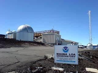
According to science historian Spencer Weart, the Keeling Curve is the “central icon of the greenhouse effect” (Weart, 2008). It is named after Charles David Keeling who, as a postgraduate geochemist, began a study in 1953 to compare the relative abundance of carbon dioxide (CO2) in water and in air. His study got the attention of many other scientists and, in 1958, Roger Reville, head of the Scripps Institute of Oceanography, encouraged Keeling to measure CO2 concentrations over the long term at an appropriately chosen site. Based on its remote location away from continents and vegetation, Reville and Keeling chose the site of the newly built Mauna Loa Observatory (Figure 1) in the high mountains of Hawaii.
The Keeling Curve
Starting in 1958, Keeling recorded daily measurements of CO2 concentration in the atmosphere. The history of these measurements is shown in Figure 2. The graph has two distinct features: (1) CO2 concentration increasing steadily from 1958 (2) with a zig-zag pattern within each year.
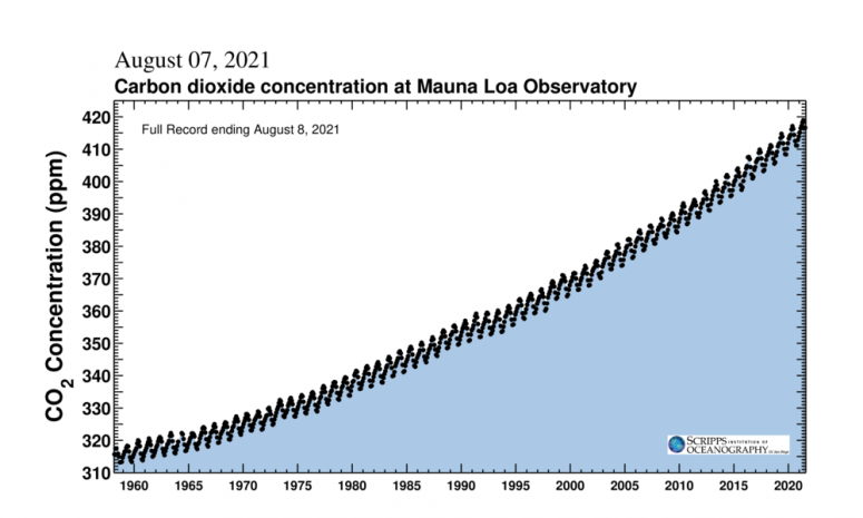
The initial CO2 concentration measured in March 1958 was 313 parts per million (ppm) compared to its current level of 414.6 ppm as at 8 August 2021. It first passed 400 ppm on 9 May 2013 and has been continuously above this level since November 2015 (Keeling et al, 2001). The last time this was the case was 100,000 years ago during the Pleistocene period when sea levels were higher and the Earth was significantly warmer.
Seasonal variation
How is the zig-zag pattern in the graph explained? Keeling’s first measurement in March 1958 was 313 ppm but then it increased by 1 ppm the following month and again in May. Levels then decreased steadily until October after which they started to rise again.
70.8% of the earth is covered by ocean and 29.2% by land, but the distribution of ocean and land between the two hemispheres is not uniform. Land mass is split 68/32 between north and south, so the northern hemisphere has significantly more vegetation than the southern hemisphere. When trees and other plants grow leaves in spring, they start to draw CO2 out of the atmosphere through photosynthesis, so that CO2 levels reach a minimum in September following the northern spring and summer. Levels then rise again during the northern autumn and winter as plants and leaves die off and decay, releasing CO2 back into the atmosphere. As a result, there is seasonal variation of approximately 5 ppm in concentrations at Mauna Loa (Keeling et al, 2001).
Today the Mauna Loa Observatory is just one of many places where CO2 concentration is measured. All sites show an upward trend but seasonal fluctuation varies between sites and is stronger in the northern hemisphere. For example, in Alaska there are very large variations (up to 15 ppm) while variations at the South Pole are negligible (< 1 ppm) (Scripps CO2 Program)
Historic carbon dioxide concentration levels
The Keeling Curve shows CO2 levels increasing since 1958 but what about earlier trends? Figure 3 shows CO2 concentrations from 1700 to 2020, based on ice core data up to 1958 and Mauna Loa data thereafter. CO2 levels were fairly flat until the second half of the nineteenth century, after which levels started to increase slowly with the rate of increase accelerating around the time Mauna Loa records began. The period after 1870 is often referred to as post-industrial in climatology.
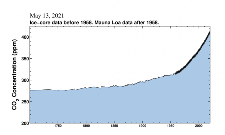
Credit Scripps Institute of Oceanography
Conclusion
The Keeling Curve clearly shows the levels of CO2 concentration increasing in post-industrial times, making it a clear indicator of anthropogenic changes to the environment. But how do these increased levels of CO2 translate into increased temperatures? How sensitive is our climate to increases in CO2? Climate sensitivity is a measure of how much the Earth’s climate will warm after a change in the climate system and is defined in terms of the warming that is expected in response to a doubling of CO2 concentration. Current evidence suggests a value of 30C for climate sensitivity but, like many things in climate science, there is a range of views from 1.50C to 4.50C (IPCC, 2013). More recent studies suggest a narrower band of 2.60C to 3.90C.
The Paris Agreement’s preferred target is to restrict post-industrial temperature increase to 1.50C. Pre-industrial CO2 concentration was about 260 ppm, so using climate sensitivity of 30C and the current CO2 concentration of 414.6 ppm, this translates into expected warming of 1.80C, emphasising the need for immediate action to reduce CO2 levels.
The Intergovernmental Panel on Climate Change (IPCC) have just published their Sixth Assessment Report : The Physical Science Basis. The report highlights the impact of the increased levels of concentration, stating starkly that “it is unequivocal that human influence has warmed the atmosphere, ocean and land. Widespread and rapid changes in the atmosphere, ocean, cryosphere and biosphere have occurred” (IPCC 2021).
Author: Gary Colclough
The views of this article do not necessarily reflect the views of the Society of Actuaries in Ireland, the Sustainability and Climate Change Steering Group, or the author’s employer.
Useful links for monitoring CO2 levels
Bloomberg Carbon Clock: Measuring Carbon Dioxide that Causes Global Warming
The Countdown 2º Clock (mcc-berlin.net)
Climate Clock | Human Impact Lab
References
Weart, Spencer (2008). The Discovery of Global Warming. Harvard University Press. JSTOR, www.jstor.org/stable/j.ctt6wpmv8.
Keeling, C.D., Piper, S.C., Bacastow, R.B., Wahlen, M., Whorf, T.P., Heimann, M. and Meijer, H.A. (2001). Exchanges of atmospheric CO2 and 13CO2 with the terrestrial biosphere and oceans from 1978 to 2000. I. Global aspects, SIO Reference Series, No. 01-06, Scripps Institution of Oceanography, San Diego, 88 pages. https://escholarship.org//uc/item/09v319r9
Collins, M., R. Knutti, J. Arblaster, J.-L. Dufresne, T. Fichefet, P. Friedlingstein, X. Gao, W.J. Gutowski, T. Johns, G. Krinner, M. Shongwe, C. Tebaldi, A.J. Weaver and M. Wehner, 2013: Long-term Climate Change: Projections, Commitments and Irreversibility. In: Climate Change 2013: The Physical Science Basis. Contribution of Working Group I to the Fifth Assessment Report of the Intergovernmental Panel on Climate Change [Stocker, T.F., D. Qin, G.-K. Plattner, M. Tignor, S.K. Allen, J. Boschung, A. Nauels, Y. Xia, V. Bex and P.M. Midgley (eds.)]. Cambridge University Press, Cambridge, United Kingdom and New York, NY, USA AR5 Climate Change 2013: The Physical Science Basis — IPCC
Sherwood, S. C.,Webb, M. J., Annan, J. D., Armour, K. C., Forster, P. M., Hargreaves, J. C., et al. (2020). An assessment of Earth's climate sensitivity using multiple lines of evidence. Reviews of Geophysics, 58, e2019RG000678. https://doi.org/10.1029/2019RG000678
IPCC( 2021): Summary for Policymakers. In: Climate Change 2021: The Physical Science Basis. Contribution of Working Group I to the Sixth Assessment Report of the Intergovernmental Panel on Climate Change [MassonDelmotte, V., P. Zhai, A. Pirani, S. L. Connors, C. Péan, S. Berger, N. Caud, Y. Chen, L. Goldfarb, M. I. Gomis, M. Huang, K. Leitzell, E. Lonnoy, J. B. R. Matthews, T. K. Maycock, T. Waterfield, O. Yelekçi, R. Yu and B. Zhou (eds.)]. Cambridge University Press. In Press. Sixth Assessment Report (ipcc.ch)